At the end of 2005, I posted some of common blog design trends out there. Time has marched on and it was time for an update. While many of these trends are not new, they are becoming more common and requested by clients when starting a new blog.
» Stacked entry dates
Dates are displayed compactly, to the left of the blog entry either in one-page-a-day mini-calendar or something simpler. Sometimes dates also stick out of the layout as little flags.
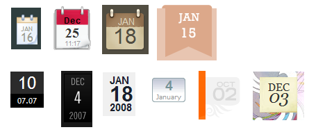
Examples include: veerle, denk-licht, works4sures, superfluousbanter, tickerville, BubblesSOC, and cult-f.
» Handmade elements
Breaking up the perfectly straight lines, shiny buttons and smooth gradients comes design which adds handmade looking elements to the design to bring a sense of originality and humanness. Whether it be masking tape, bumpy lines, drawings or watercolor paint – even the appearance of something handmade – gives the impression of breaking up the computer-driven design.
Examples include: Carsonified, Jardedigital, The World’s Leading, eleven3, Fray, Web designer wall, Verbalized and Daily Candy.
» Farewell thee tag cloud?
Once the rage, many blogs have now removed tag clouds, or relegated them to an archive page, rather than center stage. Others are using them in different ways (such as we are with Throng).
» Goodbye “Web 2.0” design?
For a long time, all the clients I came across requested that their site must look “Web 2.0”. Many now just want to be more original. While “Web 2.0 design” will remain with us for some time yet, newer blogs are using less rounded corners, gradients, shiny buttons and badges and exploring different ways of presenting blogs which complement their site’s content. Not all blogs are tech blogs!
» Out with one trend, in with another
I’d like to say that blogs are becoming less cluttered but it’s probably not true. The tiny narrow sidebars which were crammed with badges, blogrolls, reading lists, subscribe buttons and more from blogs of past have evolved into wider sidebars with grids of square ads, widgets, avatars of side visitors, Flickr feeds, badges to Facebook, MySpace, LinkedIn, etc. There will be new widgets, gimmicks and information crammed into sidebars for some time to come.
» Stretching it out
This has been happening for a number of years, but more and more blogs now sport wide screen layouts. Larger photos are being used, larger embedded videos, larger ads, larger headers. Few are liquid-based layouts but some blogs are now so wide, the reading length is less than optimal. Expect to see bigger ad formats become standard – recently spotted on our local newspaper site: 320px x 600px ads!
» Goodbye left hand column
The skinny left hand column has gone from many blogs, replaced with a wider right hand column. The three column layout has been switched to have the content in a very wide left column, with two wide right sidebars. This places more emphasis on the latest blog content as we read from left to right. The clutter is swept to the right side of the page.
» Introducing…
Many blogs now have a handy introductory paragraph for new visitors in a highlighted box. Many start with “Welcome to…” or “Hi, I’m… a …. who … . I blog about …”. If it’s a more personal blog, or the blog author wants to set a friendly tone with his audience, a photo will sit up to the right of the paragraph.
» Branching out with fonts
While designers are usually stuck with a limited number of fonts, the SIFR trend of using Flash to display any font (while keeping it readable by search engines and not an image) is still spreading slowly (even though it has been available for years). Expect to see these more on designers’ blogs, or professionally designed blogs as it can be quite technical to get it working well – even though there are WordPress plugins to help.
» But wait.. there’s more!
Have I missed something out that you’ve been noticing in blog trends lately? Please share!
Get actionable tips to grow your website
Thoughtful weekly insights (no hype!) on improving your website