

The “one stop shop” phenomenon
In the early 2000s, websites regularly aimed to be a “one stop shop” or a portal to all relevant information on a topic. One example of this is CensusAtSchool New Zealand, an ongoing educational project we’ve work on since 2003.
The site has become the first place the majority of New Zealand teachers look for information, resources and support for their teaching of statistics. It’s grown to provide approximately 1,000 teaching-resource files of its own along with indexing statistics education resources found elsewhere. It’s now a highly reputable, much loved and relied on website.
The site itself has been redesigned a few times over the years as it has expanded in the number of resources provided. How we organize resources now is in a highly structured way which aligns with the curriculum so teachers can find the resources which they’re looking for.
The flipside of being a successful “one stop shop”
However, teachers began telling us that they were finding it overwhelming to look through all the resources and decide which ones to use. The site was becoming a victim of its own success. More didn’t feel better.
It was time to redesign the site to better cater for both the time-pressed and stressed teachers, and those who were prepared to go the extra mile to gain enrichment in their teaching. A stripped-down pathway was needed for the former group containing only the most critical and best curated resources to reduce their overwhelm.
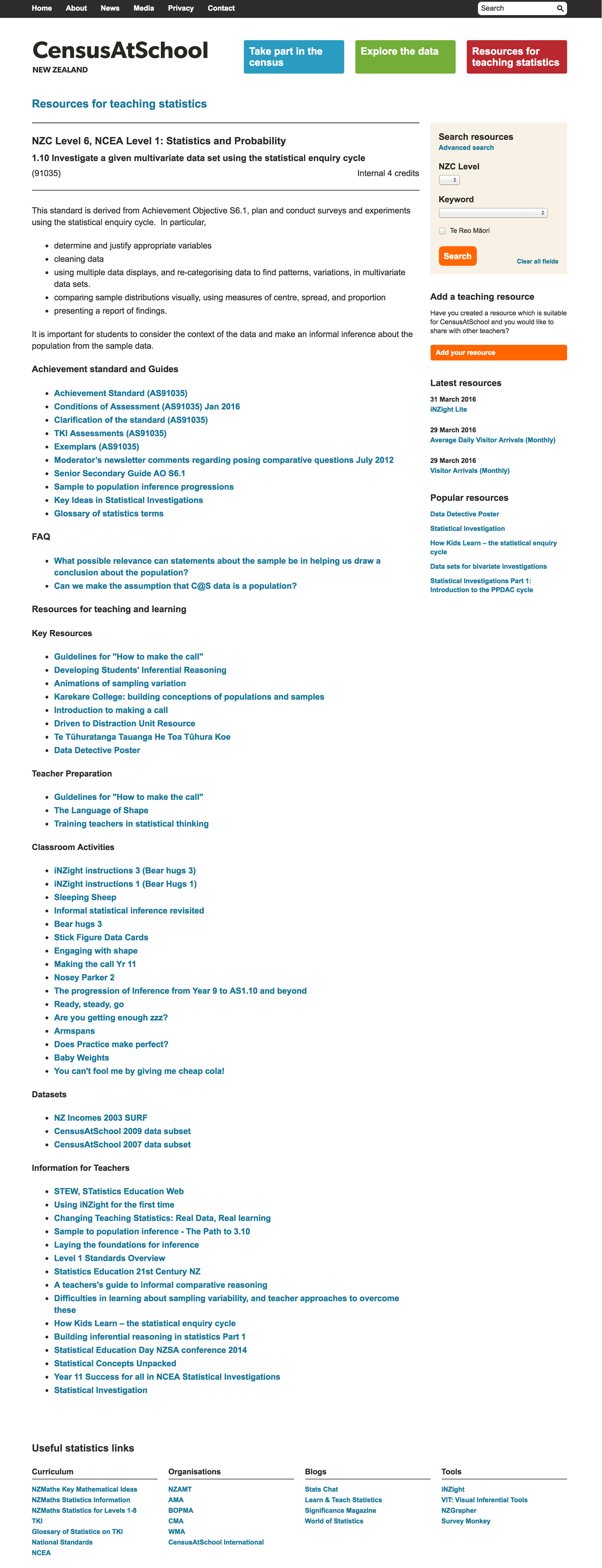
How we chose to organize resources prior to the redesign
Here’s what a typical topic page with resources looked like prior to the redesign – so much text:

Reorganizing by form rather than function
A key realization was that the resources within each topic had been divided up by their form rather than their function and this wasn’t a useful organization to the teachers.
It was quite easy to categorize a new resource as it came in as a PowerPoint, Workshop, Research Paper, Video etc. It required analysis to work out how a teacher might use the resource.
Form is easier to figure out than function.
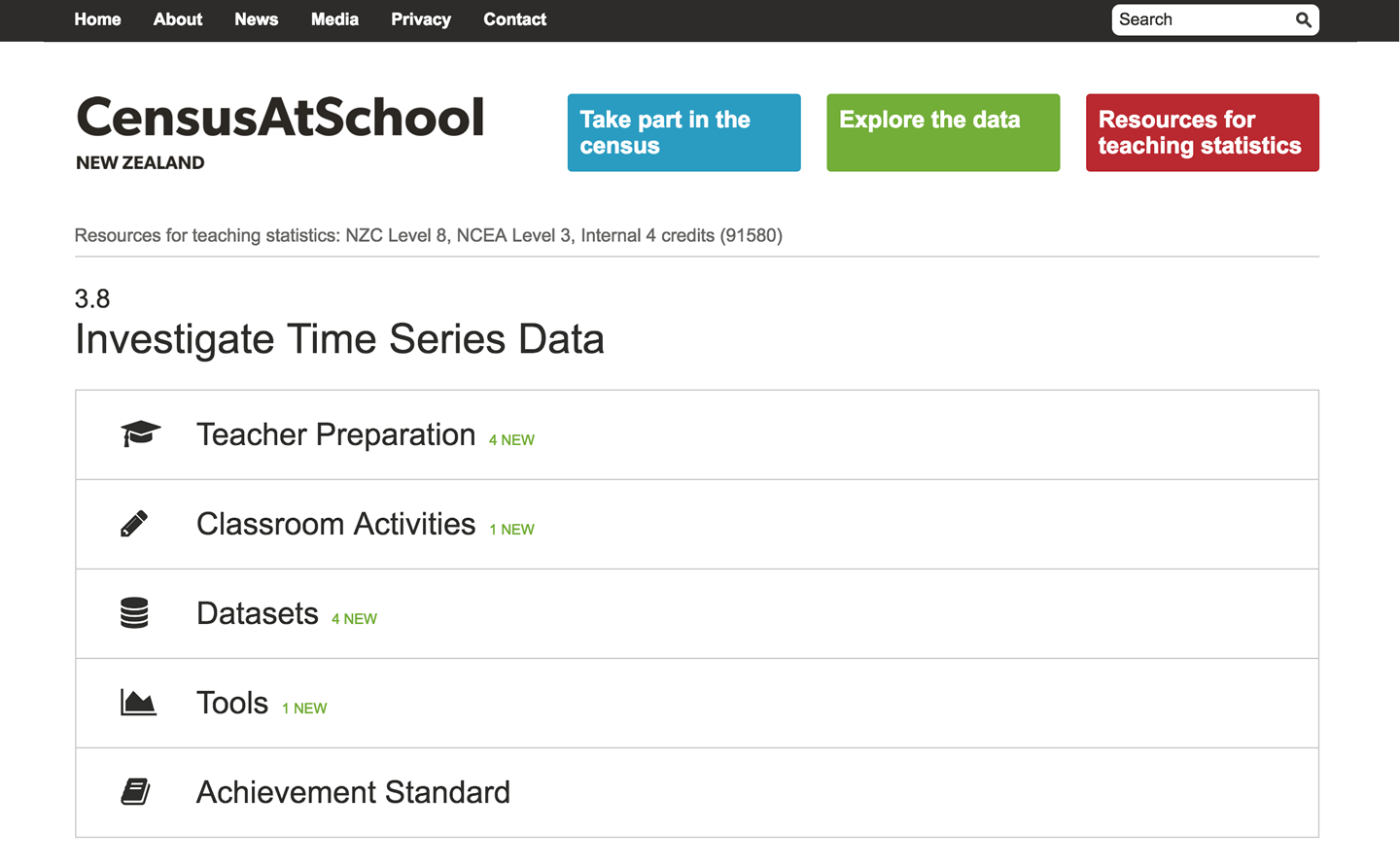
When we stepped back and looked at how teachers might use resources, we came up with a completely new way to present them:
- Teacher Preparation: for teachers wanting to learn or brush up on the topic they are about to teach
- Classroom Activities: planned lessons with all the resources needed to teach the topic
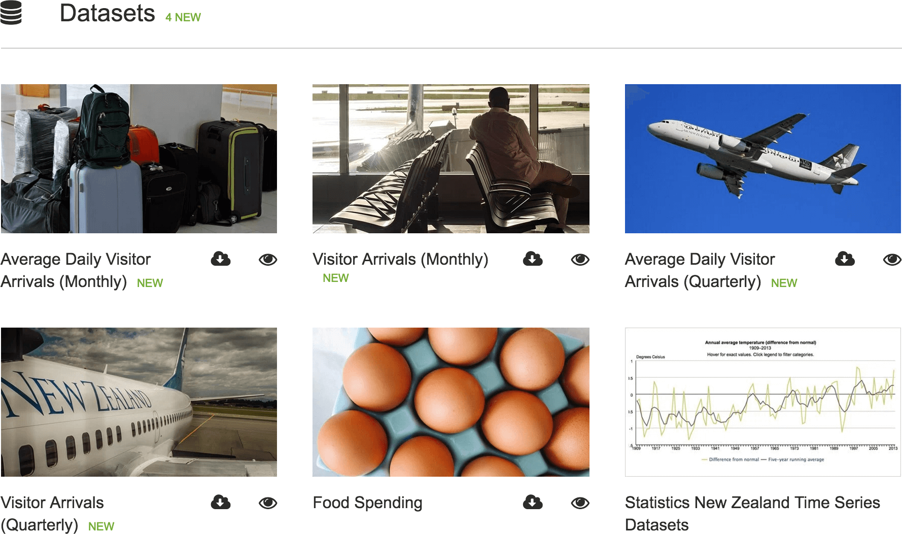
- Datasets: for teachers looking for data to use in their classrooms or for assessments
- Tools: relevant software and websites to teach the topic
- Achievement Standard: a collection of all the official government information about the curriculum relating to this topic along with other official curriculum documentation.
To reduce overwhelm, teachers first click on what type of resource they’re looking for with a topic before they see matching resources.
How we chose to organize resources after the redesign
Here’s what a typical topic page with resources looked like after the redesign:

Highlighting key resources
To reduce overwhelm we don’t always show all matching resources. If there are a lot, and some have been determined to be the critical and best resources, we only show these, and a teacher must click a button to see all the non-critical resources.
Highlighting new resources
Indicating new resources is useful. For teachers, “new” generally means since the last time they taught that topic, which is a whole year earlier. So we use “new” to mean a resource that is less than a year old. Context matters!
Using headlines and images
One reason the site began feeling overwhelming was due to the sheer amount of text on a page. It was hard to scan. We removed short descriptions of the resources from the overview pages and focused on improving the resources’ titles so they became more like headlines. Images added extra space, a preview of some sorts and visual interest to the page.

Weeding out dated resources
It feels counter-intuitive and uncomfortable to delete dated resources. Someone might need for something, someday, right? A good clean out is necessary though. It helps everyone to only present resources which are current, relevant and useful. It takes time to assess each resource and decide whether or not to delete it and shouldn’t be rushed.
Get feedback early and often
Throughout the process, we got teachers to give feedback on the redesigned overview page. We set up a real working example on the site with real content and worked on improving how we would organize resources at the same time as the design.
Once an example page was completed, we got more feedback from all the teachers on our mailing list. It was unanimously extremely positive.
Incentivise feedback
We encouraged feedback by also asking teachers which topic pages they’d like us to migrate to the new design next, promising to bump their requests to the top of the list. The great thing is that pages can be converted to the new design as we complete them, rather than having to wait until all 21 topic pages are completed!
Key takeaway for reorganizing your content
Organize by function, rather than form.
For example, instead of choosing to organize resources into sections such as whitepapers, videos, podcasts, ebooks, reports etc try organizing by what people are looking for – e.g. by topic: Search Engine Optimization, Search Engine Marketing and Social Media Marketing.