
Saveur had over 30,000 nominations for their 7th Annual Blog Awards in 13 categories. These are now down to the 78 finalists and voting is open until the end of August. One of the categories is the Best New Food Blog award.
In this post, I’ll be covering the six finalists for the best new food blog launched in 2015 or 2016 so that you can see what is possible to achieve with your food blog in under two years.
Best New Food Blog Finalists
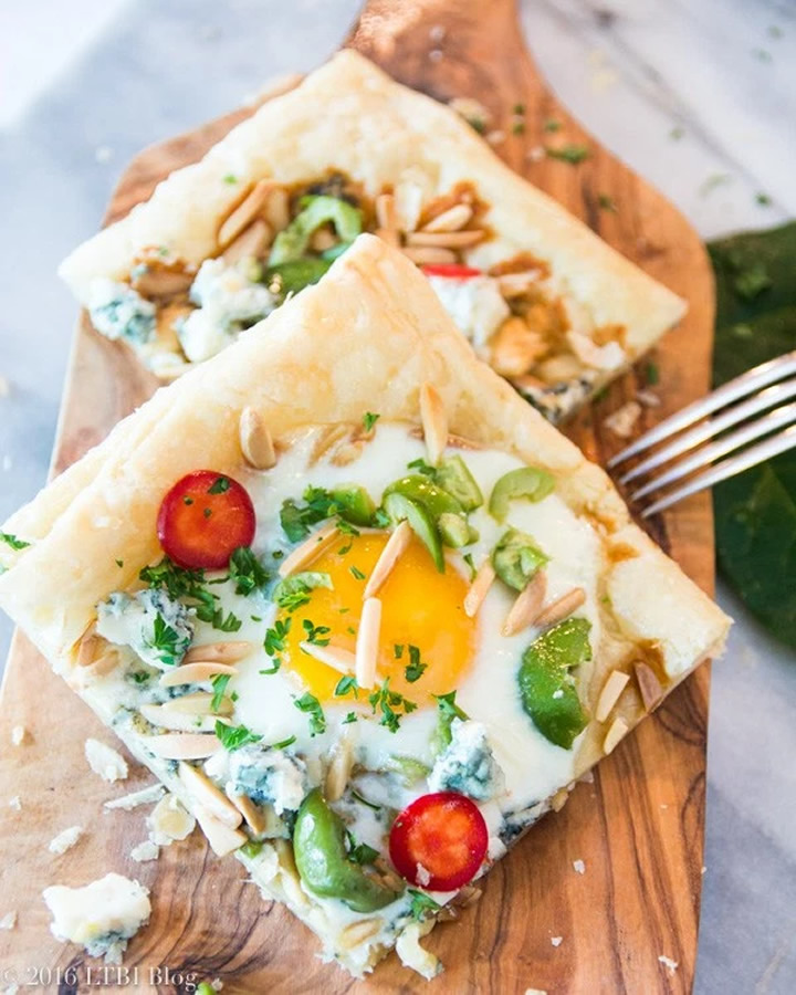
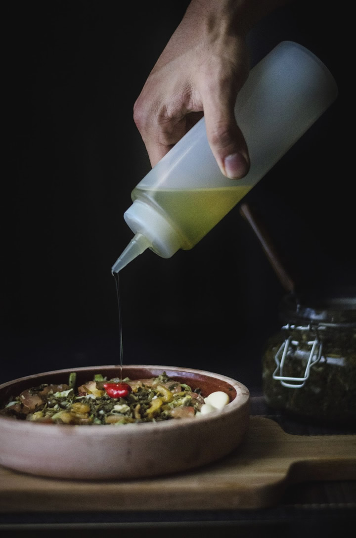
The quality of these blogs is incredible. In each case, the photography is stunning and the writing has a very strong voice. For many, there is a unique twist in the type of content they’re writing too – it’s more than simply blogging a bunch of recipes.
For each of the six finalists, I cover when the blog was launched, what it’s about, who is writing it, the theme they’re using, frequency of posts, social media followings, and uniqueness. I’ve also included five improvements I would suggest for each finalist in the best new food blog category.
Last year the editor’s award went to Faring Well and the reader’s choice was Fix Feast Flair. I look forward to finding out who wins this award!
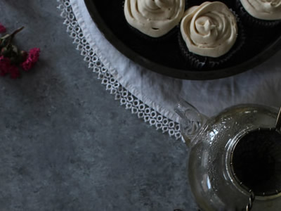
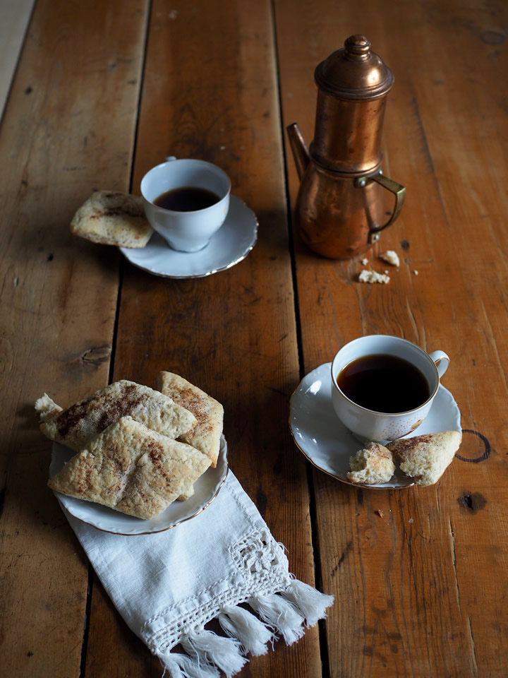
Harvest & Honey

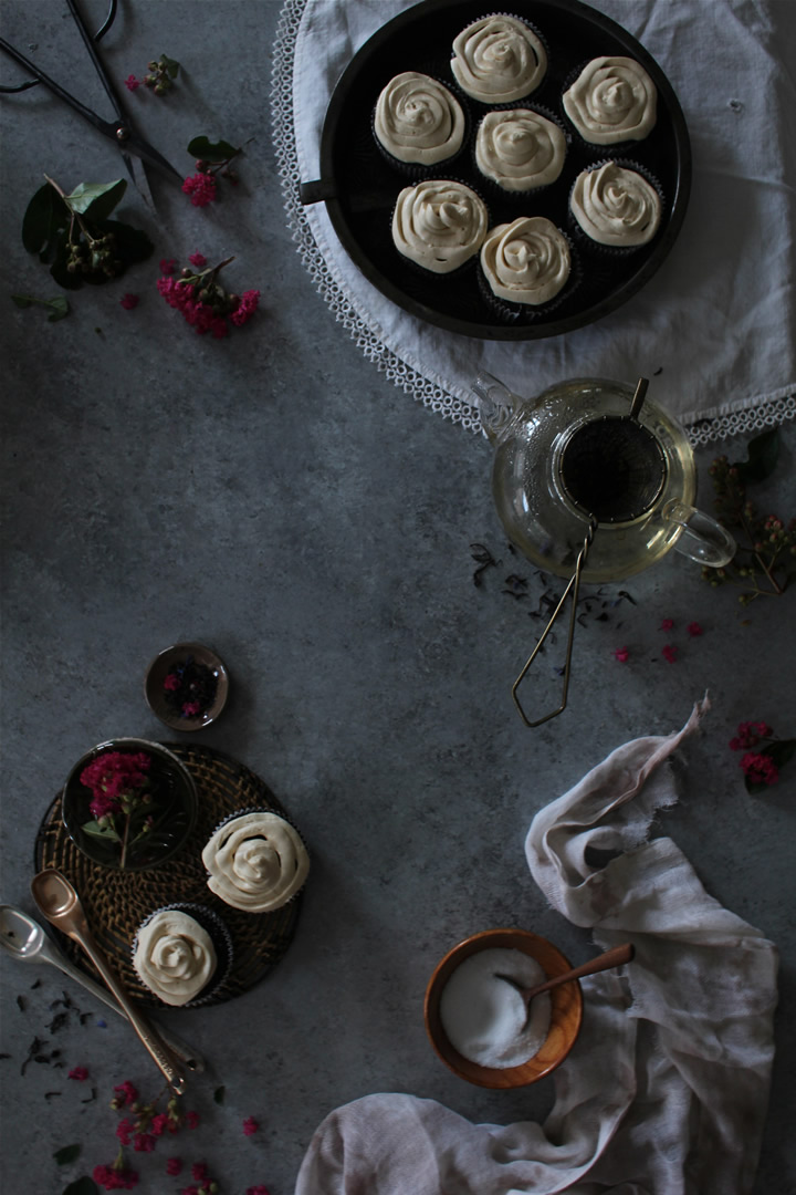
Photographer: Lauren McDuffie, Harvest & Honey
Lauren McDuffie started her food blog in 2009 but relaunched Harvest & Honey in 2015. Part memoir, part recipes, the blog is true culinary storytelling. Lauren is an author from Indianapolis.
Harvest & Honey has a very simple blog design and uses the free WordPress.com theme called Yoko. She posts about once a week on average.
Her blog picked up a bunch of press coverage this summer for her edible flower salad. She has over 8,000 followers on Instagram, 237 followers on Facebook and 661 on Twitter.
What makes her blog stand out at first glance are her gorgeous photos. They’re moody, full of richness, depth and storytelling. Her warm thoughtful writing is just as captivating and is as if you’re reading excerpts from a novel you don’t want to end.
Five improvements I’d recommend:
- Making the logo retina quality so it’s not blurry on newer screens and clickable back to the homepage as this is the norm.
- Changing the light green writing to a much darker color to make it easier to read.
- Improving recipe archives so it’s faster loading and easier to find what you’re looking for.
- Adding a more detailed about page with photo and detailed bio.
- Using a recipe plugin and Yoast SEO plugin to improve SEO and make it easier to print, save or share her recipes.
Let’s Taco Bout It

Photographer: Mica Mccook, Let’s Taco Bout It
Charlotte Bona Vida, Mica Mccook, Stephani Casey teamed together their writing, recipe developing, photography and cooking skills to launch Let’s Taco Bout It from Austin in May 2015. Each month, they take a new book and create recipes inspired by it.
Let’s Taco Bout It has a very simple blog design and uses a Creative Market theme called Mani.
Their blog has had Huffington Post and Buzzfeed coverage, amongst others. Their blog has 448 followers on Instagram, 461 followers on Facebook, 196 on Pinterest and 1034 on Twitter.
I love the concept of their blog – it’s so original and fun. The community aspect of having a book and food club could be expanded out a whole lot more too. I’d love to see more writing in some of the posts to talk more about the recipes, their development and story.
Five improvements I’d recommend:
- Adding a new professional logo which isn’t fuzzy quality and matches the design of the rest of the site.
- Making the focus of the blog clearer – it’s not necessarily immediately obvious that they are combining their love of food and books. For example, there’s no clear way to see all the books they’ve created recipes for so far, or no easy way to see the current book of the month. And, it’s not clear what the blog title means – perhaps an “About” page would help.
- Improving the readability of the white text overlays on the photos.
- Tidying up formatting in posts – put spacing around photos, remove all the extra bullets. from the print tab of the recipes, fix related posts which have missing images.
- Making it easier to explore recipes with a well-organized recipe index page.
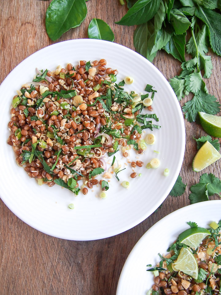
Lime & Cilantro

Photographer: Soe Thein, Lime & Cilantro
Soe Thein moved to the US six years ago from Myanmar and is studying medicine in California. He started his blog in January 2015 to share his life stories and food experiments. While some recipes are more traditional, he also pushes the boundaries with recipes such as turmeric and ginger ice-cream.
Lime & Cilantro has a very simple blog design and uses Blogger. He posts about once a week on average.
He has over 3,500 followers on Instagram, 845 followers on Facebook and 48 on Pinterest.
What makes his food blog stand out initially are the beautiful photographs with dark moody backgrounds and they usually include his hands in the process of making the recipe. I love how he writes too – it’s very personal, full of his personality and one of the few food blogs I’ve seen by a male student who is typically cooking for one. And, it’s a niche one with recipes focusing on his Burmese culture.
Five improvements I’d recommend:
- Moving from Blogger to WordPress which gives you so much more flexibility and options.
- Making the site mobile-friendly (aka responsive) – it’s not currently and this will be lowering his search engine rankings for mobile users, and making it harder for them to read his site too.
- Tightening up the blog’s branding – the logo, site fonts, search box etc don’t gel into a cohesive brand currently. His content is amazing and the site’s design should align better with it.
- Making the logo retina quality so it’s not blurry on newer screens and clickable back to the homepage as this is the norm.
- Adding in a visual recipe index. Soe’s photos are incredible, it’s a shame not to highlight these more throughout the site.
North Wild Kitchen

Photographer: Nevada Berg, North Wild Kitchen
Nevada Berg moved from the US to start a new life on a farm in Norway. Her blog documents her learning about traditional cooking methods in Norway, the people and local food stories. Next year, she will be offering cooking classes in person.
North Wild Kitchen uses the Hemlock theme from Themeforest. Berg posts about twice a week on average.
She has over 454 followers on Instagram, 1,781 followers on Facebook and 147 on Pinterest.
Her food blog has a lovely logo and clear brand which matches her style and location. It has beautiful large photos which help tell a story, rather than repeat the same dish in many angle (like many food blogs). I love that you can explore by season and how visual the entire site is.
Five improvements I’d recommend:
- Fixing the header. When scrolling down the page, the header overlaps the first image and jumps you down the page. It makes it difficult to properly see the first image ever and is quite jarring.
- Adding her full name to the site – it’s on her Instagram and elsewhere but it makes for a strange about page and contact page.
- Using a recipe plugin for SEO and so that you can print, share and save recipes easily.
- Adding a newsletter subscription option as another way to subscribe to the blog and get traffic back to the site.
- Renaming photos using descriptive titles for better SEO.
The Brick Kitchen
Photographer: Claudia Brick, The Brick Kitchen
Claudia Brick is another medical student in the finalists – she is a 19 year old New Zealander studying in Melbourne. She started The Brick Kitchen in January 2015 as a side passion project. Mixed in with recipes, she also features cafe reviews from both Melbourne and Auckland.
The Brick Kitchen uses the Foodie Pro theme. Claudia posts twice a week on average.
She has over 3,800 followers on Instagram, 575 followers on Facebook and 1,900 on Pinterest.
What makes her blog stand out initially are the beautiful professionally shot photographs which have tiny pieces of imperfection added in which are perfectly styled. I enjoy reading the little glimpses into her life too. Her work is stunning, and she’s so young. You would think that lots of food blogs would include cafe reviews, but they don’t seem to – I love that she’s added this into her content mix.
Five improvements I’d recommend:
- Adding personality into her blog design – e.g. a unique logo, some whimsical elements or some color. It’s currently very plain and uses the default Foodie Pro favicon.
- Switching from Foodie Pro theme to Clean Food. Yes, I’m biased, but I do think that the recipe index, features, usability and navigation would be a whole lot better using our theme which was created as an alternative to Foodie Pro.
- Optimizing images to speed up the site – e.g. there are currently almost 6MB of images on the homepage.
- Making it possible to explore the list of cafes she’s reviewed by rating, suburb or map. I love this section of content on her site, but it’s hard to get an overview of what she’s reviewed.
- Fixing up the footer copyright and broken contact link (https error).
Vermilion Roots
Photographer: Christine Leong, Vermilion Roots
Christine Leong is a professional writer and editor with a magazine background. She started Vermilion Roots in May 2015 when she moved from Malaysia to California. She blogs about healthy Asian cuisine.
The food blog runs on Squarespace using the Five template and she posts twice a week on average.
She has over 1,134 followers on Instagram, 1,861 followers on Facebook, 1,102 on Twitter and 2,100 on Pinterest.
Her blog stands out with its bright fresh food and colors with plenty of greenery. I also love that the raw ingredients are often shown in the same photo as the finished dish. It makes it more unique, compact and fresh feeling. The blog’s aesthetic matches her food perfectly: it’s clean, fresh and bright. Her interview series with other food bloggers is worth reading.
Five improvements I’d recommend:
- Using a recipe plugin for SEO and so that you can print, share and save recipes easily. (Squarespace doesn’t have one which is a shame, and a reason why many food bloggers move to WordPress.)
- Adding in related posts, or more suggestions of content to explore when you get to the bottom of a post.
- Updating the recipe index so there’s more scrolling, less clicking required to view all of the recipes in a category (especially on your mobile).
- Moving the logo left – it looks oddly placed being over a bit on the right.
- Reducing the big space below the names in the comments section
Support these new food bloggers


I encourage you to get to know and support these new food bloggers for their incredible success in such a short amount of time. And, go vote for your favorite best new food blog in the awards.
Considering launching a food blog or need help with one?
Check out our Clean Food theme (plus we have an affiliate program) or book in a free introductory call with me.