Blog
Thoughts on design, blogging, community, and more.
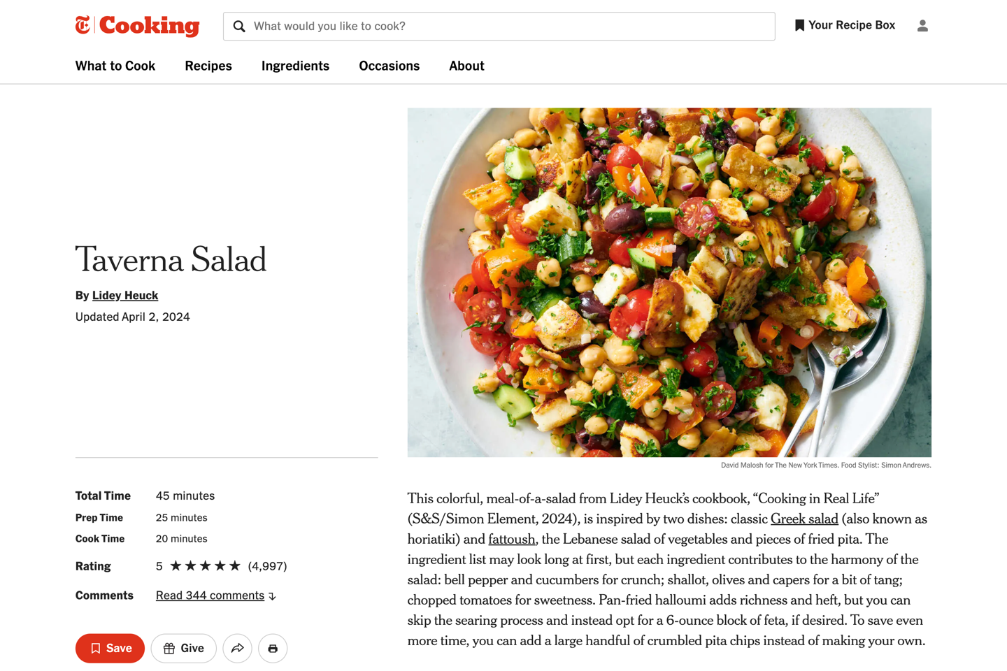
Good people doing good things
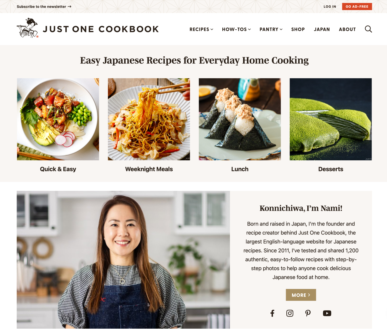
We recently worked with Katie Heath on her branding and to launch her new recipe website, Katie’s Kitchen Counter, and with Villa Cocina to migrate their site from a broken theme to a fresh start with our Design Food Package. Please go give them both a follow!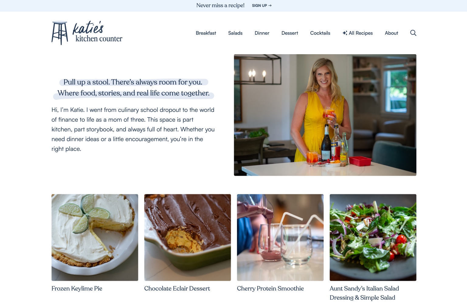
The rise of the monthly challenge?
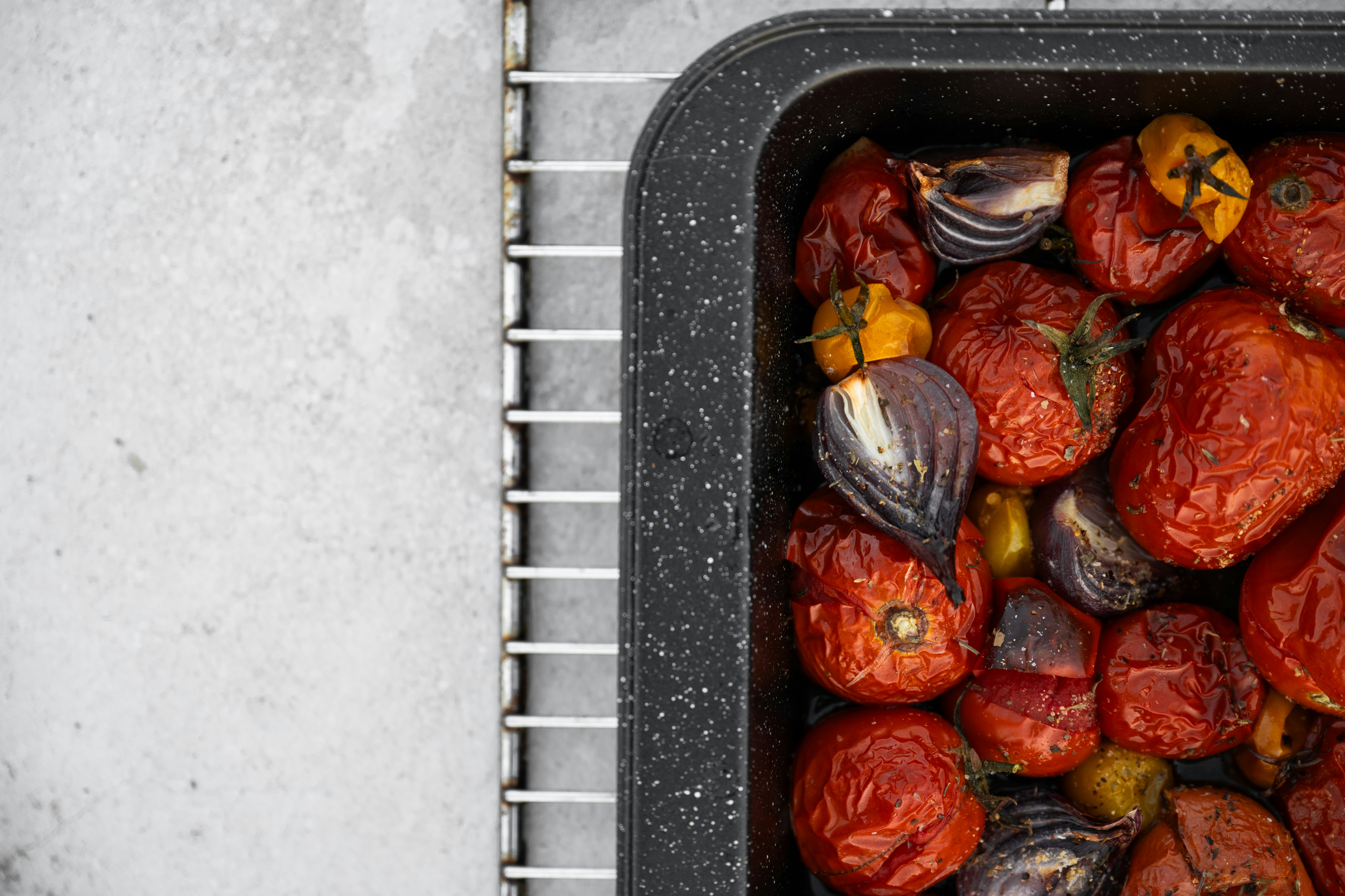
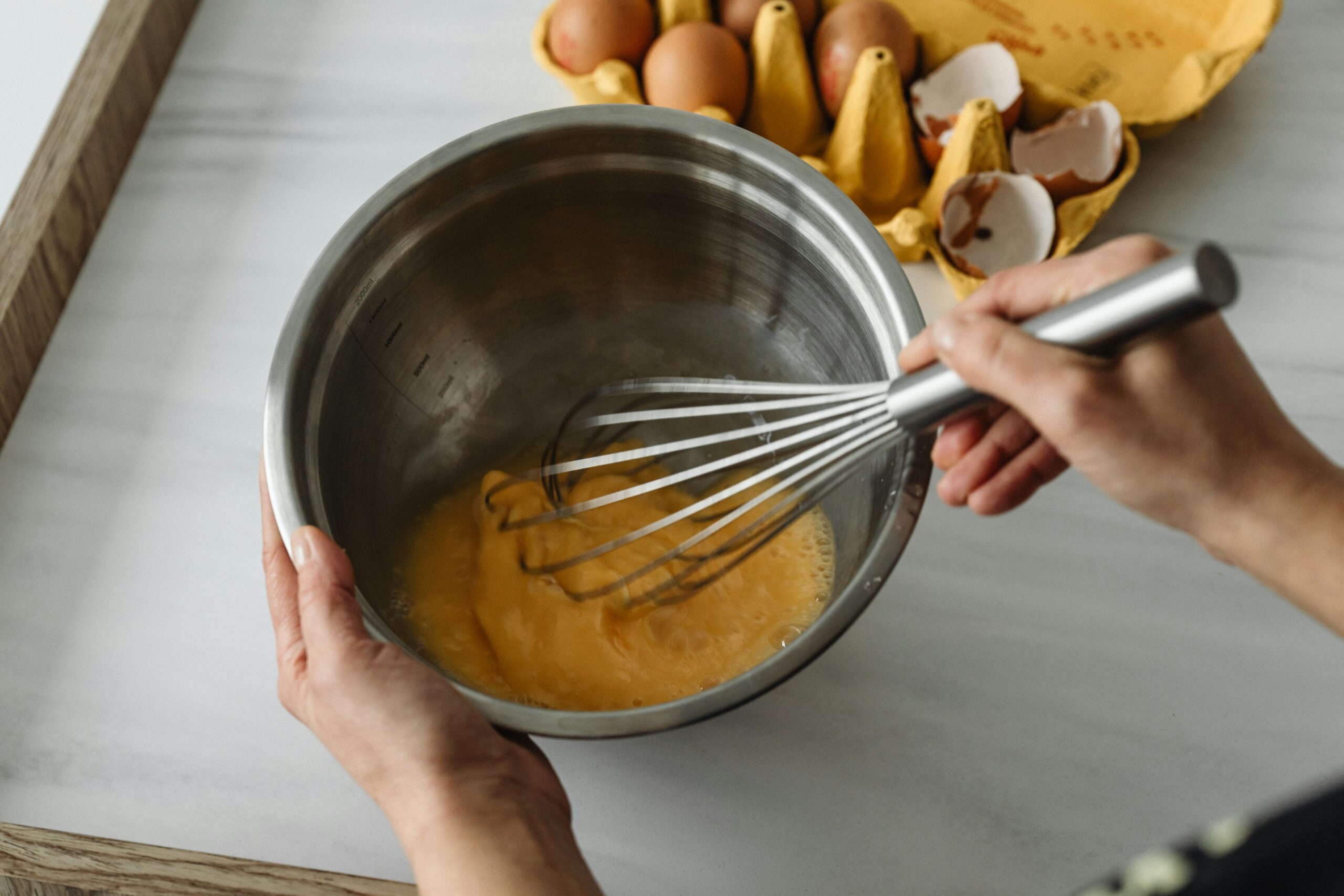
Cooking & Baking Challenges Several of our clients have recently asked for help adding a monthly Cooking or Baking Challenge to their food blogs. These are not new–Sally’s Baking Addiction was likely the first to launch one in 2017–but interest in them is definitely growing.
When You’re Woozy, Design Matters
Last night I made the mistake of thinking I didn’t need pain meds anymore. I woke up at 1 a.m. with an aching jaw (still recovering from wisdom teeth surgery) and a sharp reminder of someone telling me to “stay ahead of the pain” as I scrambled for a pill to swallow, hoping that pain at this stage was “normal”.