The “three horizontal lines” or “hamburger menu drawer” icon
-

- February 13, 2014
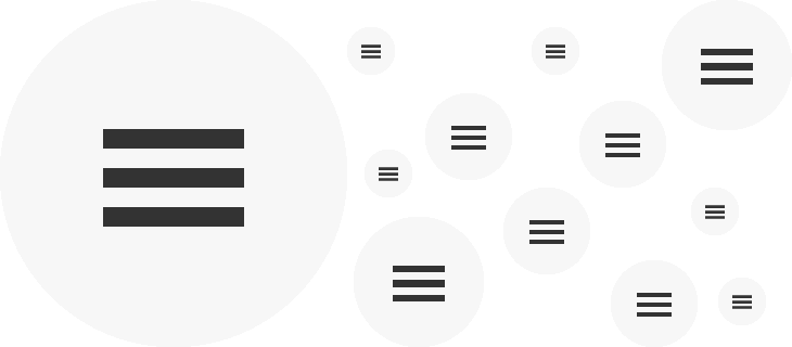
In the last couple of years, the “three lines” or “hamburger menu drawer” icon has become the de facto standard icon to represent a collapsed menu.
The icon is believed to have originated in apps such as Facebook and Path, then it spread to other mobile apps, responsive websites viewed on mobiles and even to other software such as Chrome.
I think it’s fantastic that there’s now a nice sense of familiarity and consistency across different fields: there’s far too examples of icons where confusion and inconsistency reigns.
Apps
In the apps I currently have on my phone, the following use this icon: Feedly, Facebook, Spotify, Wunderlist, Gmail, IMDB, QuizUp and Paper.
Responsive websites viewed on small screens
Most of the responsive sites we design use this icon when viewed on a small screen. Some use the word “MENU” instead.
Responsive websites viewed on large screens
This is a more recent trend. Where space is not at a premium, some sites are still choosing to hide their menu behind this icon and requiring some form of interaction (an extra click, mouse movement or touch) in order to see the navigation options.
While this may make a site look trendy, cleaner, minimalistic, more focused and less overwhelming, it’s potentially making it more difficult for people to actually use the site. Here are some different examples and my thoughts on whether or not they make for a good user experience.
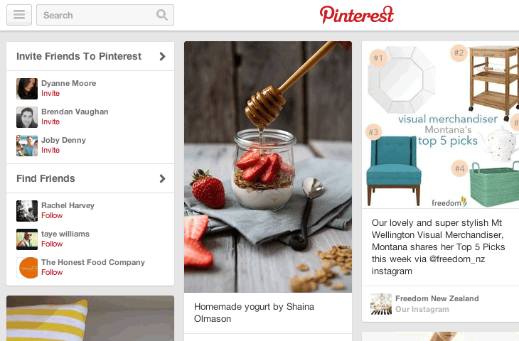
In this instance, Pinterest keeps the focus on the latest pinned content, and provides a menu if you do wish to look at other general categories of pins. I don’t mind having the navigation hidden here as I don’t use it often and it’s not really a website where I’m navigating pages through a menu. I do use the search a lot though!
Quartz
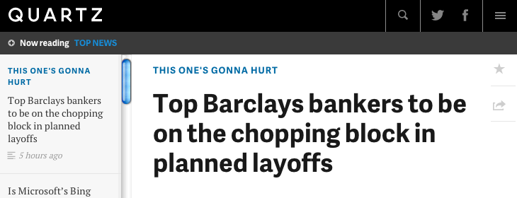
Here, Quartz places non-essential navigation items behind the menu icon. It hides other main menu items behind the top “Now reading” bar – but essentially, if you’re going there to read the latest articles, you don’t need to do anything else but scroll down the content, or jump down via the list of articles on the left.
The New York Times
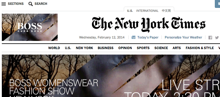
As part of its recent redesign, The New York Times has used the menu icon along with the title “Sections”. Clicking on this brings up a side navigation menu which can expand out several levels deep. On the homepage, top level sections are additionally accessible via the horizontal top menu. The horizontal menu also has a “All Sections” link which pulls out the side menu rather than having little dropdown menus for the horizontal menu. When you scroll down the homepage, the horizontal menu sticks to the top of the screen. “All sections” text disappears and is replaced by the menu icon. I quite like this approach.
Interestingly, the horizontal menu disappears entirely when you’re reading a single article and you’re just left with the menu icon. This reflects the likely purpose you’re on a page on the site: when you’re on the homepage, navigating to other news sections is likely to be far more important than when you’re reading an article.
Auria
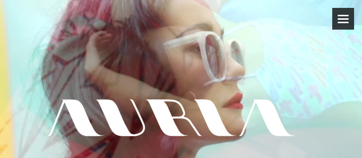
Fashion brand Auria has no top navigation apart from the menu icon, even on large screens. I think this works well with the content: you scroll down the latest collection and see information and links to past collections down the very bottom. The menu icon is clearly visible in a consistent spot as you scroll down the page, but removes visual clutter and keeps the focus on the photography.
SquareSpace
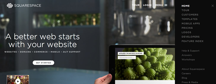
I’m not a fan of SquareSpace’s use of the menu icon. Firstly, there’s a mix of an expanded menu, the word menu and the icon. The menu comes in from the right and pushes the page off to the left. You can’t scroll down the page, so unless you’re wanting a tour, to “get started” or to log in, you have to open up the menu to see what’s on offer. There’s no footer navigation either. It’s amazing that support and contact are initially hidden from view and I can’t see a good reason for it.
Other examples
Ammunition Group has a menu icon, but it’s not necessary to access it: it just provides a way to jump down a long single page site. However, I did wonder if I was missing out on something in that menu, since I couldn’t initially tell what was in it or what it did.
Big Spaceship has a fixed menu icon for its navigation. Its homepage provides links to each of the main pages from within the content. For those coming into the site via another page, it’s a little less efficient to find what you’re looking for than if the menu options were always visible.
The Conference takes this a step further and doesn’t even include all the main menu items within its homepage content. Here it feels frustrating having to continually click to open the menu to navigate through the site.
Conclusion
This trend can start to feel a little like mystery meat navigation has been reincarnated.
Hiding navigation behind a menu icon even on large screens can be useful, but can also be problematic: this is similar to all other forms of navigation including the much-debated drop down menu. On small screens, there’s a necessity to use a collapsed menu. On large screens there should be a clear reason for it and not because it looks trendy.
As I was writing this, an excellent article came in from Nielsen Norman Group: Killing Off the Global Navigation: One Trend to Avoid. In it they conclude:
“For desktop sites, demoting your main content categories into a drop-down menu makes it harder for users to discover your offerings.”
P.S.
For a cute little nod to the hamburger name, click on the menu icon over at The Magazine.
Optimize for connection
Grow your business with a website that cuts through the noise and connects with real humans.
Get my thoughtful + calm web strategy tips weekly:
Rachel Cunliffe
Rachel is the designer at cre8d. Her design aesthetic is clean, clear, and creative, ensuring your site is fast, user-friendly, and optimized for search. She lives with her husband and four children on a small farm in New Zealand.