Why Food Bloggers Are Pointing to NYT Cooking
-

- April 22, 2025
Lately, almost every food blogger I’ve spoken with about redesigning their site brings up the same one: NYT Cooking.
Not because it’s flashy. Or new. Or doing anything revolutionary.
It’s something else entirely: it just feels good to use. Calm. Clear. Considered. Like it was made by people who care deeply about cooking… and the people doing it.
That’s worth paying attention to.
- It’s spacious
There’s room to breathe. Nothing feels crammed. The layout is simple and generous, more like a publication than a blog. You can focus. That makes the whole experience feel more trustworthy. - It’s quietly confident
The design isn’t trying to impress you. No flashy tricks, just great type, a gentle colour palette, and a calm, steady structure. - The menus actually help
Those mega menu dropdowns are thoughtfully grouped by things like meal type, upcoming holiday, method, and dietary need. You’re not dumped into a wall of links, you’re gently guided.
That kind of structure is becoming more common, and for good reason. It works.
But it’s not only the homepage that’s doing the work. Click into a recipe, and the thoughtful details continue.
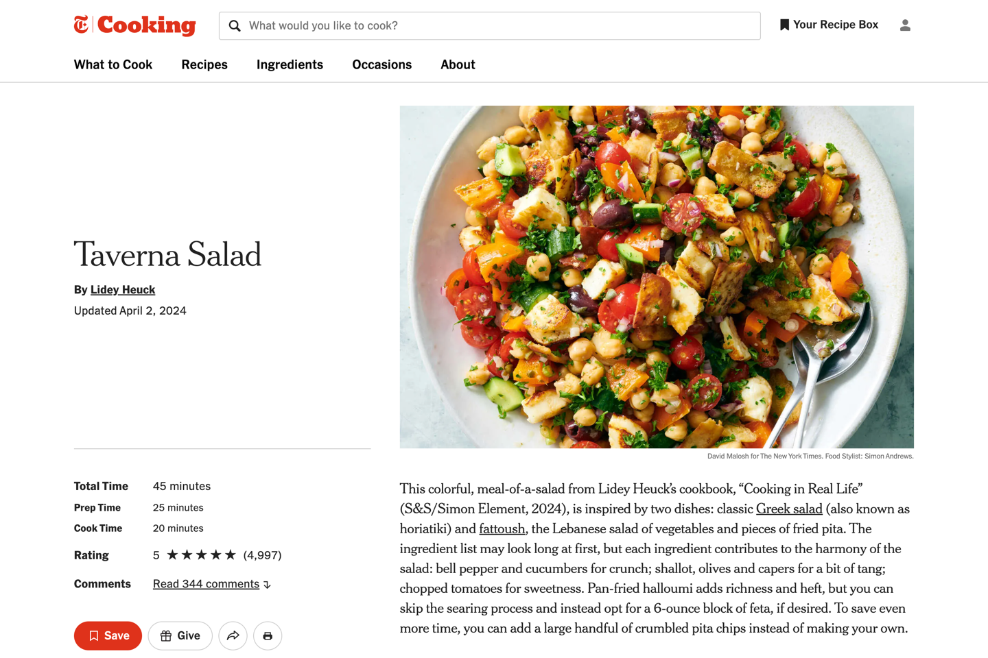
- The recipe comes first
You get a photo, a short headnote, and then straight into the recipe. No endless scroll. No delay. The assumption is: you’re here to cook, and they won’t waste your time. - The recipe fills the space
On desktop, there’s no sidebar. No newsletter sign-up box. No links to other recipes competing for attention. The card fills the width of the page and it breathes. Steps are clearly separated, text is well spaced, and everything is easy to scan at a glance. - It’s designed for real cooking
There’s a Cook Mode that makes the text even larger and strips away distractions. It’s a quiet but thoughtful feature. - The comments are useful
You can search the comments or sort by most helpful. So if someone swapped out an ingredient or left a smart tip, it’s easy to find without scrolling through 200 questions you’re not actually trying to answer. - It’s not begging for your email
No pop-ups. No sticky bars. No mid-recipe interruptions asking you to subscribe. You’re trusted to make that decision yourself. Ironically, that makes you want to stick around longer. - The writing adds just enough
The headnotes don’t over-explain or overshare. They add something useful (context, a tip, a personal note) and then step aside. It’s restrained, but still personal.
So why are food bloggers pointing to NYT Cooking? Because it doesn’t try to do everything. It just does the right things, and does them well.
If you’re thinking about your site and how you want it to feel, that’s a good place to start.
Of course, NYT Cooking operates on a different business model: subscription-based rather than ads.
It’s a quiet reminder of how many design and content decisions across food blogs today are shaped (or compromised) by advertising needs.
That said, it doesn’t mean food bloggers have to show every ad possible. Some of our clients choose to push back against ad agency recommendations and only display what they’re comfortable with. There’s always room to make more intentional choices and to design with the reader’s experience in mind.
If you need help bringing that clarity to your site, please get in touch. Let’s make it happen.
Want a calmer, more effective website that connects with your audience?
Get thoughtful insights and tips in our weekly newsletter.
Rachel Cunliffe
Rachel is the designer at cre8d. Her design aesthetic is clean, clear, and creative, ensuring your site is fast, user-friendly, and optimized for search. She lives with her husband and four children on a small farm in New Zealand.